
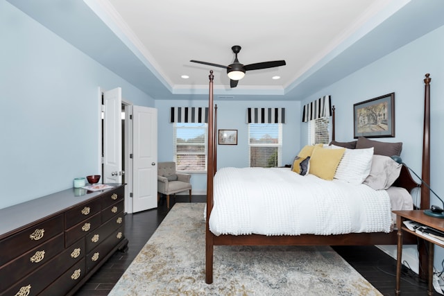

The bedroom is the only room in your home that is devoted to rest. It is the place where you relax, rejuvenate and (hopefully) get a good sleep after a hard day. However, the colour of a bedroom is one of the strongest factors that many individuals do not consider when trying to determine the mood of a bedroom. The colour of your walls does much more than create a visual impression. It may influence your mood, your energy level, and even your sleep quality.
So when it comes to picking the right colour for bedroom walls, the decision deserves more thought than simply grabbing your favourite shade off the paint chart. In this guide, we will discuss which colours are most effective, the psychology of colours and how to select a palette that will transform your bedroom into a true sanctuary.
Table of Contents
The Psychology of Colour
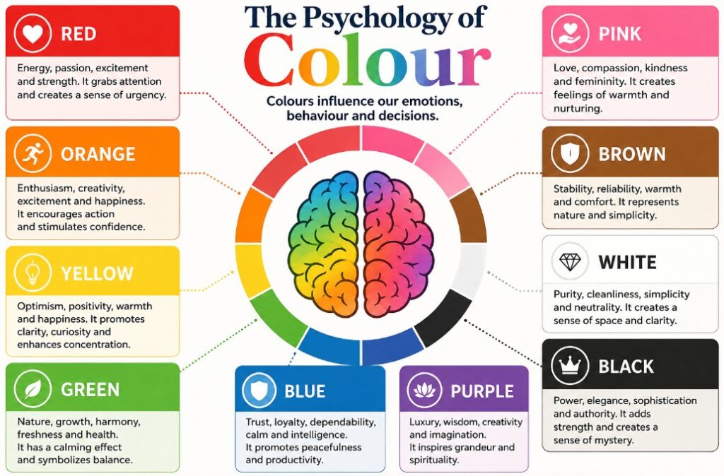
Colour psychology is the science of the effects of various colours on human behaviour and emotion. It is not a pseudoscience; it is used by designers, hospitals, and hospitality brands. Cool colours such as blue and green are more likely to slow the heart rate and promote relaxation, whereas warm and high-saturation colours such as bright red and orange are more likely to promote energy and alertness. For a space built around relaxation, that distinction matters enormously.
When choosing the most appropriate colour to use in bedroom walls, consider the emotional feeling you would like to experience every morning and night. Would you like to be soothed and cocooned, or bright and awake? The majority of individuals desire their bedroom to be conducive to relaxation, that is why low-to-muted saturation colours tend to be more effective than bright and vivid colours in this specific room.
Blue: The Ultimate Calming Choice
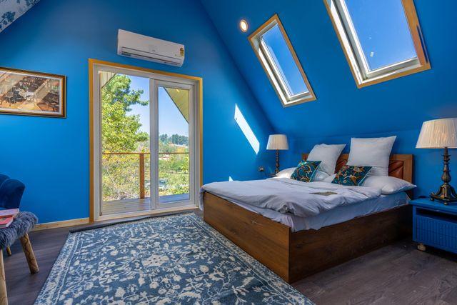
Blue is always among the top bedroom colours, and with a reason. Research has associated blue interiors with reduced blood pressure and reduced heart rates, which are both conducive to the body to sleep. The dusky blues and pale sky colours are soft and airy without being cold. Darker navy is also a great option, as it provides a feeling of depth and coziness, combined with warm light and soft materials. In case you are afraid of making a bold choice, a light powder blue is a safe, universally flattering place to begin.
Green: Relaxing and Calming
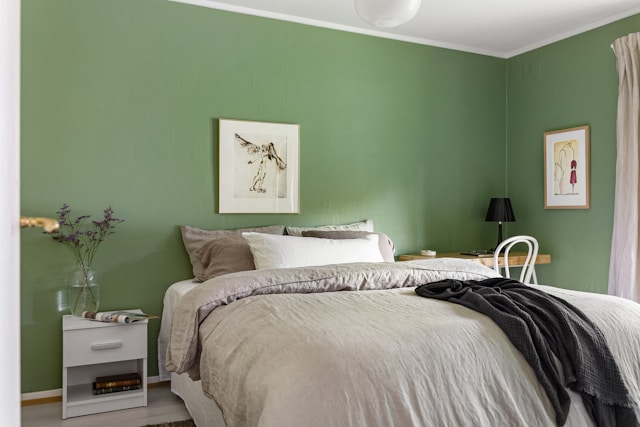
Green is a beautiful mixture of blue and yellow. Being the most natural colour, it gives a calming, earthy effect to a room. Sage, olive and eucalyptus are particularly trending at the moment and provide a spa-like calmness that is refreshing and soothing. Green also does not strain the eyes and so it is a good colour to use in a room where you wish to turn off. It combines well with natural substances such as wood, linen, and rattan.
Soft Neutrals: Timeless and Versatile
Soft neutrals are difficult to resist in case you want a classic, minimalistic appearance. Warm greys, soft beige, and the perennial favourite, greige (greys mixed with beige) make a calming background that will never go out of fashion. Neutrals are amazingly adaptable, as you can switch out your bedding, artwork, and accessories without having to repaint. The secret is to select neutrals that have a warm rather than a cold, clinical undertone; a bedroom must be cozy, not cold. Layering different textures within a neutral scheme keeps it from feeling flat or boring.
Lavender and Soft Purple
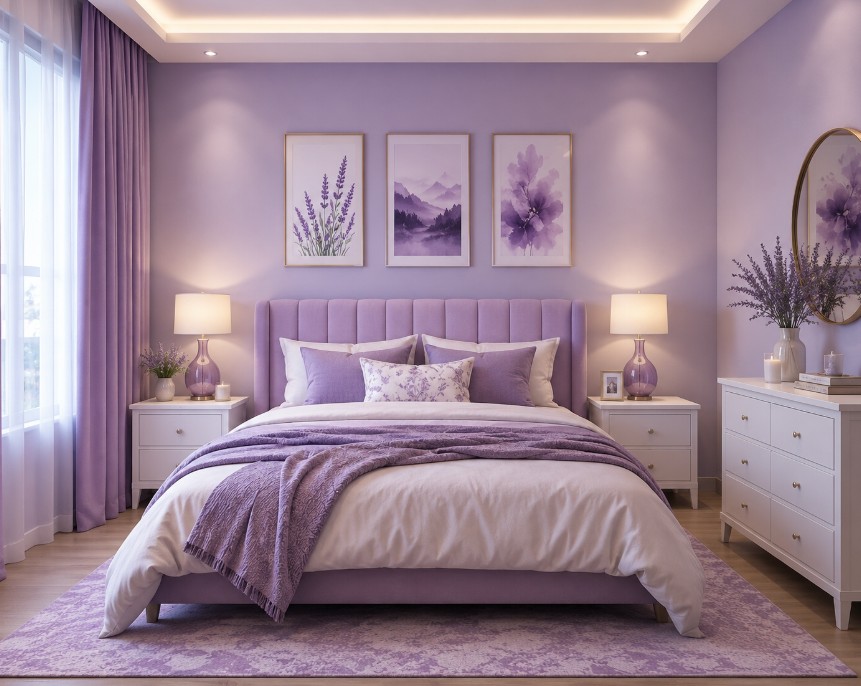
Soft lavender and subdued purple are worth mentioning in case one wants something a bit different. These soft hues bring the relaxing effects of blue and bring in a sense of warmth and character. Lavender especially has been linked to relaxation. Consider the perfume of so many sleeping pills. A dusty purple that is pale enough will turn a bedroom into a classy and relaxing place without going too juvenile.
Colours to Approach With Caution
Not all shades are appropriate in a bedroom. Certain colours are too stimulating to be included in a space constructed around rest, but most can find a place as small accents. The most important thing to consider when choosing a colour for bedroom walls is moderation: save your brightest colours to the details and not the central act.
- Vivid Reds and Oranges
Bright oranges and intense reds are vibrant, lively and eye-catching, and that is why they do not work as bedroom walls. They increase the energy levels and may cause difficulty in turning off at night. If you love them, introduce them through cushions, throws, or a single piece of artwork rather than across an entire wall.
- Bright, Electric Yellow
Yellow may be happy and sunny, but in its most saturated and intense form it is overstimulating and even eye-wearying in the long run. A lighter, more subdued mustard or buttery sound is a softer option in case you do not want the glare but still want some yellow.
- Stark, Brilliant White
Brilliant white is crisp and clean, but in large amounts it may be perceived as clinical and restless instead of relaxing. Replacing it with soft off-white, cream or warm ivory maintains the lightness but introduces the comfort a bedroom requires.
Practical Factors to Consider
In addition to psychology, there are some practical considerations that should inform your ultimate decision. Even the most beautiful shade can fall flat in the wrong setting, so weigh these considerations before you commit.
- Natural Light
The colour of light varies drastically during the day. What appears to be a perfect shade in a sunny, south-facing room might appear grey or dark in a darker, north-facing room. Always put a few samples on the wall and see them in the morning, afternoon and evening before making a decision.
- Room Size
Colour is capable of redefining a space visually. Small bedrooms are made to look larger and more open with light, airy colours, whereas the darker, more intense colours enclose a bigger room in a cozy, snug feeling. Adjust the shade to the effect you desire instead of struggling with the proportions of your room.
- Personal Preference
Lastly, do not disregard your instincts. The “correct” colour for bedroom walls is ultimately the one that makes you feel at peace, so let your personal taste sit comfortably alongside the general guidelines above.
Conclusion
So, which colour is best for a bedroom? For the majority of individuals, cool colours such as blue and green or warm colours such as layered neutrals are the most relaxing. Light, low-saturation colours are more likely to help you sleep and feel more relaxed than bright and vivid colours. However, the ideal colour to use in bedroom walls is a combination of established colour psychology and your personality. Take your time, experiment with a few samples under your own light, and select the shade that will enable you to fall asleep easily and wake up feeling truly refreshed.
Read more interesting posts here.
