Creating a custom home that appears to be classic and timeless yet functions as a modern home is a real challenge. The last thing most people want is a stuffy, cramped, hermetically sealed jewel box of a house that’s dark, costly to heat and cool, and busily demanding constant upkeep and repairs. They don’t want a cavernous, echo-filled, cookie-cutter, open-concept trophy home that’s destined to turn into an obsolete white elephant in 50 years.
There’s a sweet spot in the middle. A human-scaled house that suits your lifestyle, wasting no space, and with electric, plumbing, and heating/air systems that are as maintenance-free as possible. It’s also bright, airy, and comfortable year-round, with energy costs rivalling a city apartment. A house you’d like to retire in 30 or 40 years from now, be happy to grow old in. None of this can be achieved with adding a few “smart home” features to an existing template mansion floor plan.
Table of Contents
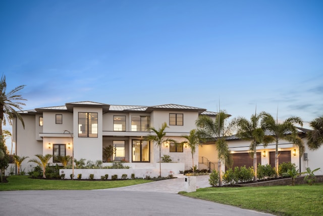
Start With The Exterior Massing Before Anything Else
Before there’s even a floor plan, you need to commit to a vernacular – basically, a local architectural language. Craftsman bungalow, Colonial Revival, Tudor, Georgian, Farmhouse: they each come with their own proportions, rooflines, window rhythms, and materials. Pick one and actually follow its rules. That’s what gives a house the feeling of belonging somewhere rather than just being plonked on a plot.
And it’s not just about looks. The massing decision is also your first big energy move. A good architect will do both at the same time – figuring out how the house sits on the land so the main living spaces get southern or eastern light. You capture the morning sun, you cut your heating load, and you’re already ahead. Layer in a decent building envelope – proper continuous insulation, good air sealing – and it doesn’t matter that the outside looks like it was built in 1920. The thing will perform. The two just don’t have to fight each other.
The Broken-Plan Alternative To Open Concept
Full open-concept became such a default that nobody really questioned it anymore. But it’s a bad fit for a house that’s meant to feel traditional. The acoustics are awful, spaces bleed into each other, and you lose that sense of moving through a sequence of rooms – which is actually a big part of what makes older houses feel good to be in.
Broken-plan solves this without swinging to the opposite extreme. You’re not closing everything off, you’re just giving each space enough definition to feel like its own thing. Pocket doors, wide archways, partial walls, level changes – these maintain the connection without everything collapsing into one big room. A double-sided fireplace between a living room and a library is the classic example: both spaces stay intimate and self-contained, and neither one is borrowing its character from the other.
Glass-panelled pocket doors are particularly good here. Light and sightlines come through, but the rooms can still function independently when you want them to.
What this actually buys you is a kitchen that works properly as a kitchen – real layout, real storage, no compromises – right next to a dining room that genuinely feels like a dining room. Not a dining zone. A room with a door.
Getting Millwork Proportions Right
Adding crown moulding, wainscoting, and high baseboards is the easiest way to introduce classical character – and the easiest way to ruin a room if the room’s proportions aren’t balanced. The size of trim elements should correspond to ceiling height. Tall, elaborate crown profiles are heavy and squish a room with eight-foot ceilings. Thin, flat trim appears chintzy and under-dimensioned in a room with ten or eleven-foot ceilings.
As a rough approximation: baseboard height should be roughly one inch per foot of ceiling height. Crown moulding should fill about the top eight to ten percent of wall height. Wainscoting, if you are using it, should traditionally be placed at chair-rail height – about one-third of the wall.
These proportions naturally evolved. They matter. Ignore them and the details that are supposed to telegraph quality instead send up red flags. Get them right and even painted MDF trim reads as the real thing.
The Show Kitchen And The Working Kitchen
Older homes weren’t built with kitchens that could handle the heft of modern cooking – they were built with the presence of a butler’s pantry, in between your entertaining space and your kitchen. That geometric concept is still worth stealing.
The highly visible speaking space of the kitchen gets all the beautiful cabinetry you want to hang out in – with inset doors, unlacquered brass hardware, natural stone or wood countertops, and a range that looks like it’s over one hundred years old. In the kitchen is where everyone is doing the hustle and all the house’s cheerfulness is pouring out. The butler’s pantry (or scullery), hidden just back from it, is where the other dishwasher goes, the countertop appliances, the bigger, deeper prep sink, the bulk storage, and all the clutter for the coffee station. It is allowed to be a mess in there and nobody minds because the door closes.
83% of people making decisions on new homes today think a laundry room is essential or desirable. 81% think that about a walk-in pantry (NAHB, What Home Buyers Really Want). According to this same survey of actual buyers in the market, almost no homes come with either of these things. So design them in from the start, in the right amounts and in the right places, and you have solved the single biggest functional-life difference that separates old-house living from what households need today.
While we’re on the topic, a quick shoutout to the morning room: another one of those lost types from architectural history that is right for reconsideration today. If you want to find unique architectural features for your home, the morning room is worth a look. It was historically conceived as a warm, bright, east-facing room right off the kitchen where you might take your morning light like a cat. In practice today it often becomes casual dining, a little coffee corner, or a quiet sitting area between the kitchen and the garden – and it ends up being the best room in the house.
Windows That Look Historic And Perform Like Modern Ones
This is the detail that gets botched more than almost anything else. Traditional divided-light windows – thin profiles, lots of small panes – are genuinely hard to replicate in a thermally decent unit without something looking slightly wrong about them.
Simulated Divided Lites (SDLs) are the answer. A modern fiberglass or aluminium-clad wood window with SDL grilles applied between and inside the glass gives you the visual rhythm of true divided lights while keeping a proper insulating unit underneath. The key is getting the grille width right. Historic sash bars were narrow – around an inch – and SDLs specified to match that read correctly. The thicker grilles that come as standard on most modern windows don’t, and you can tell immediately even if you can’t say why.
But the individual window is only half the problem. Fenestration rhythm – how the windows are spaced, grouped, and proportioned on the facade – is what actually communicates the home’s architectural character. Get that wrong and it doesn’t matter how good the window itself is.
Hiding The Technology
Traditional style and obvious high-tech gadgetry don’t go well together. So the solution isn’t the absence of technology; it’s the clever design of the technology’s concealment.
First, anchor everything in a central gear closet. A standard coat closet can be a smart home gear nexus, with good ventilation added from wall to attic. Conduit pathways planned during the framing stage will also prevent you from ever having to cut open a wall, just in case a new wire standard is introduced in 2041.
Light-wise, select trimless, plaster-in recessed lighting. Invisible speakers can be installed behind grilles that are painted the same color as the millwork they’re set in. In the kitchen, outlets for small appliances can be mounted under the upper cabinets so that appliances don’t have cords snaking down the wall. Most small countertop items can be hidden behind tambour door appliance garages. Refrigerator drawers can have cabinet panels mounted on them. Dishwasher drawers can look like any other set of cabinet drawers.
Layering Light Rather Than Punching Holes
The default modern lighting approach of recessed cans looks wrong in a classically detailed room. A ceiling covered in evenly spaced recessed fixtures reads as an office ceiling. That’s what happens when all lighting is handled at one layer.
A better approach combines three separate layers. Ambient light from hidden LED cove lighting tucked behind crown molding or ceiling coffers. This washes the ceiling with soft light without any visible fixture. Architectural accent light from classic wall sconces flanking mantels, mirrors, and doorways. Creating visual warmth at eye level. And a statement fixture – a chandelier, a lantern, a pendant – that serves as a focal point and anchors the room spatially.
Recessed may still appear in this scheme, but sparingly, in task areas like kitchen counters and reading nooks, where function justifies the presence of a ceiling aperture.
Mixing Materials Without Losing Coherence
Throwing reclaimed and contemporary materials together can easily look unfinished. The difference between that and something that actually works is usually just how deliberately the contrast is handled.
Reclaimed elements – hand-hewn ceiling beams, antique mantel surrounds, wide-plank oak floors – bring a texture and weight that new materials simply can’t fake. Good architectural salvage from demolished buildings carries real age with it. But these things work best when they’re sitting next to something clean and current, not surrounded by more of the same.
A kitchen with rough-sawn ceiling beams makes sense when the cabinets below are flat-fronted and the counters are polished quartz. It goes muddy when everything around the beams is also distressed and textural. The contrast is what makes each material actually register – take it away and everything just competes.
Steel-framed glass interior doors are a good example of this working in the other direction. They’re completely modern in character, but their thin profiles aren’t that far off from historic divided-light windows proportionally, and they sit well in traditional interiors in a way that shouldn’t really work but does.
The Mudroom As A Modern Necessity
Old houses had back entries and boot rooms. The mudroom is the same thing, just renamed – and it should be treated like a proper room, not an afterthought squeezed in near the garage door.
A good mudroom is what stops the house from being chaotic. Without one, everything – coats, bags, shoes, sports kit, dog leads – ends up somewhere it shouldn’t be. With one that’s been properly thought through, all of that has a place and it stays there.
What that actually means in practice: built-in lockers or cubbies per family member, a bench with storage underneath, a utility sink, hooks at two heights, and somewhere in the cabinetry to charge things. None of that happens without square footage, and none of it works without thinking about adjacency early in the design process. It needs to sit between the garage entry and the laundry room so the messy, functional part of the house is all in one corner – and the rest of the plan can stay clean.
Building Something That Earns Its Age
The most enduring homes are the ones designed with careful, thoughtful consideration of how the people who live in them will use them. The shape and size of your home should be a direct response to your needs. Too many homes are built as a stylistic expression alone, empty canvases for the homeowner to fill with furniture to taste. The great spaces of any era were completely conceived spaces. Furniture was used to supplement the room, not determine it. The eye should travel around in delight, but draw the line at chaos.
